A3 Graphic Posters (Digital Prints, Limited Edition. 25)
1. Shrooms & Biscuits // 2. Kitchen Sanctuary
Logos
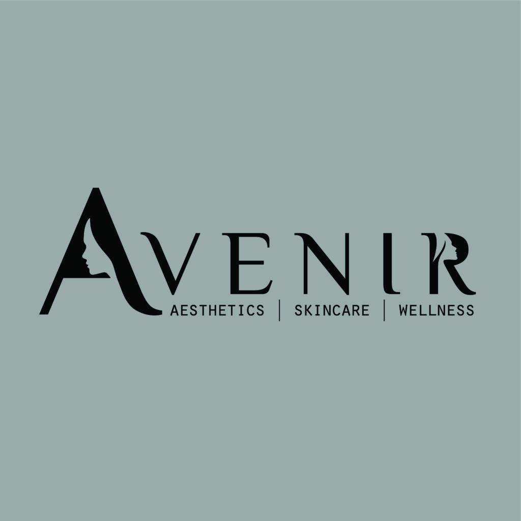
1. Press Record (Ghost Writer Music Sales) // 2. Ronin (vehicle customs) //3. Ware 22 (Warehouse Creative Collective) // 4. Bento Buddha (Streetfood Brand) // 5. Lifeforce.Live (Healthy Living Brand) // 6. Avenir (skin & Cosmetics brand)

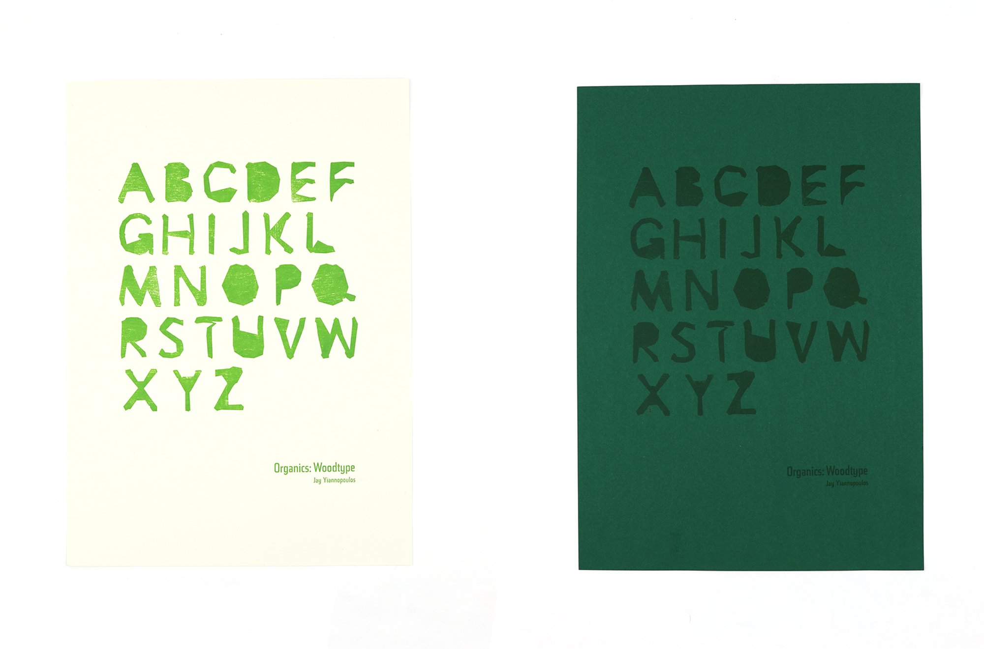
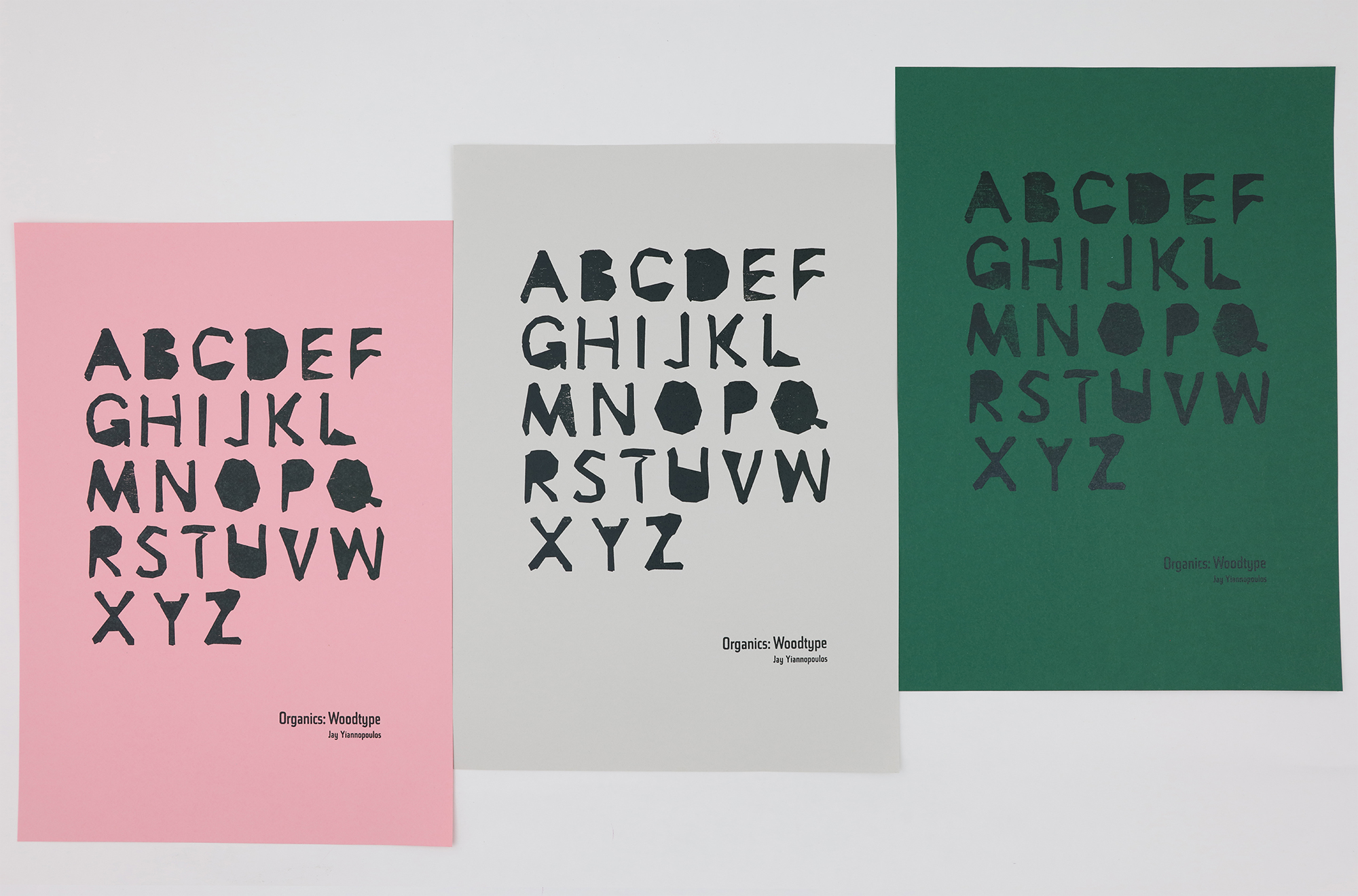
ORGANICS
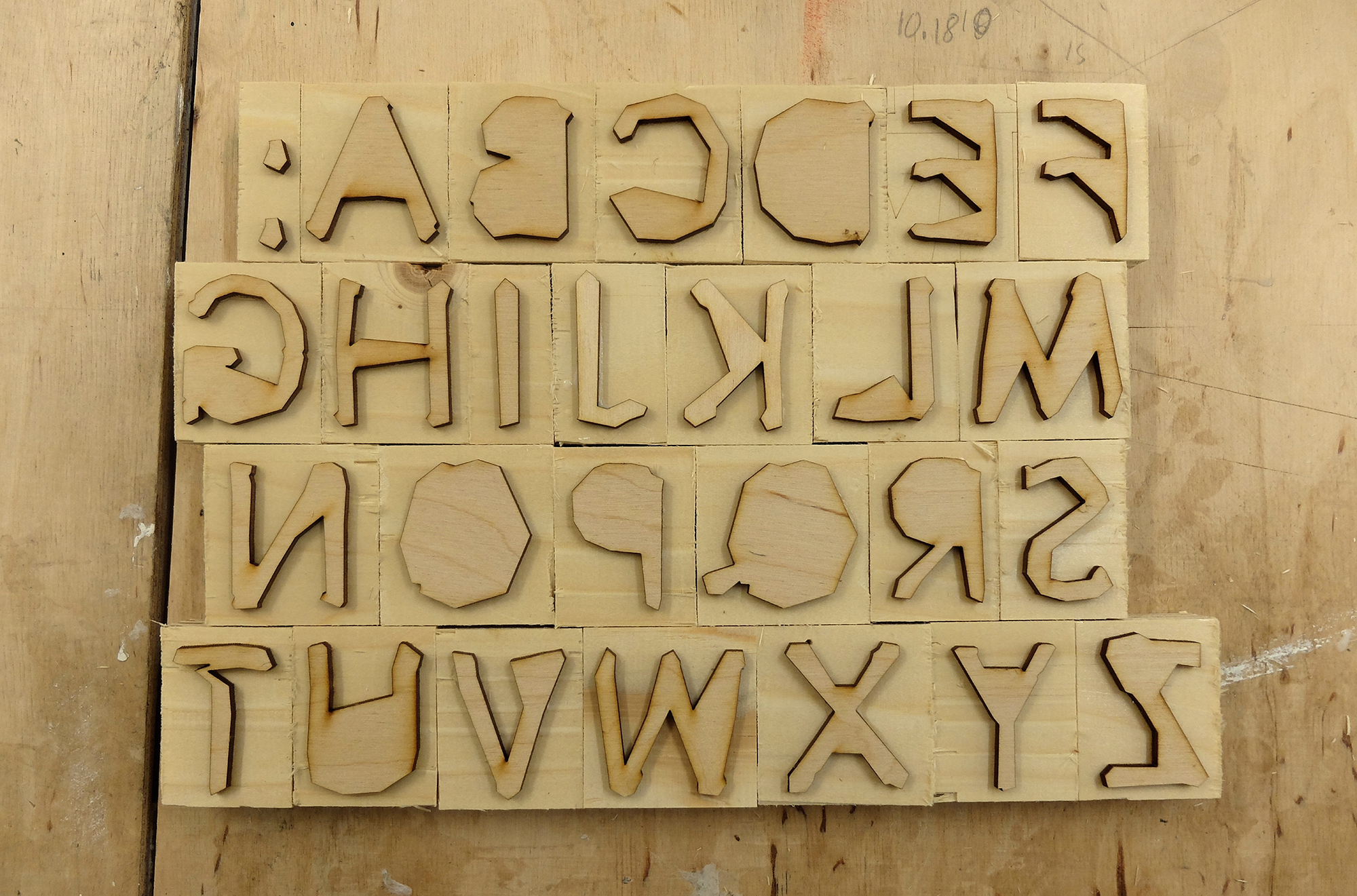
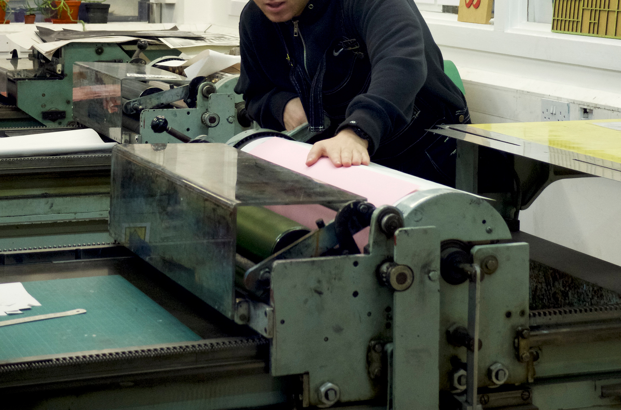
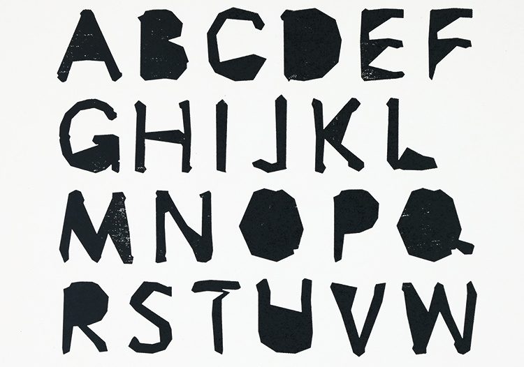
Woodtype Design
This was a personal typography exploration project, I created an uppercase (type high) display typeface set to be used on the letter press. The letterforms, all of which are hand drawn, explore a type with raw & natural themes, taking a my inspiration from shapes in nature particularly trees.
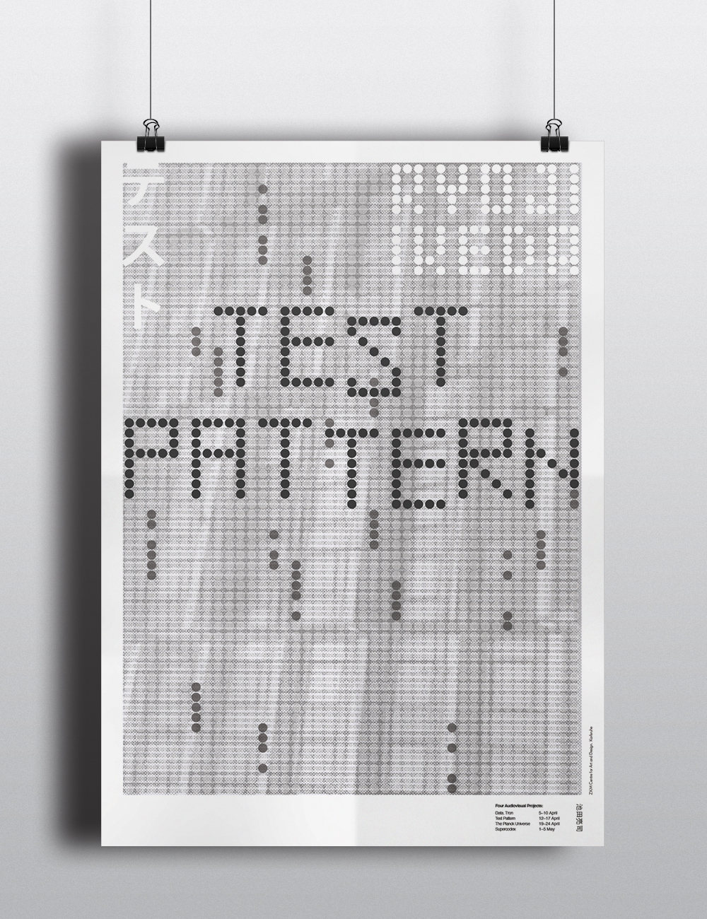
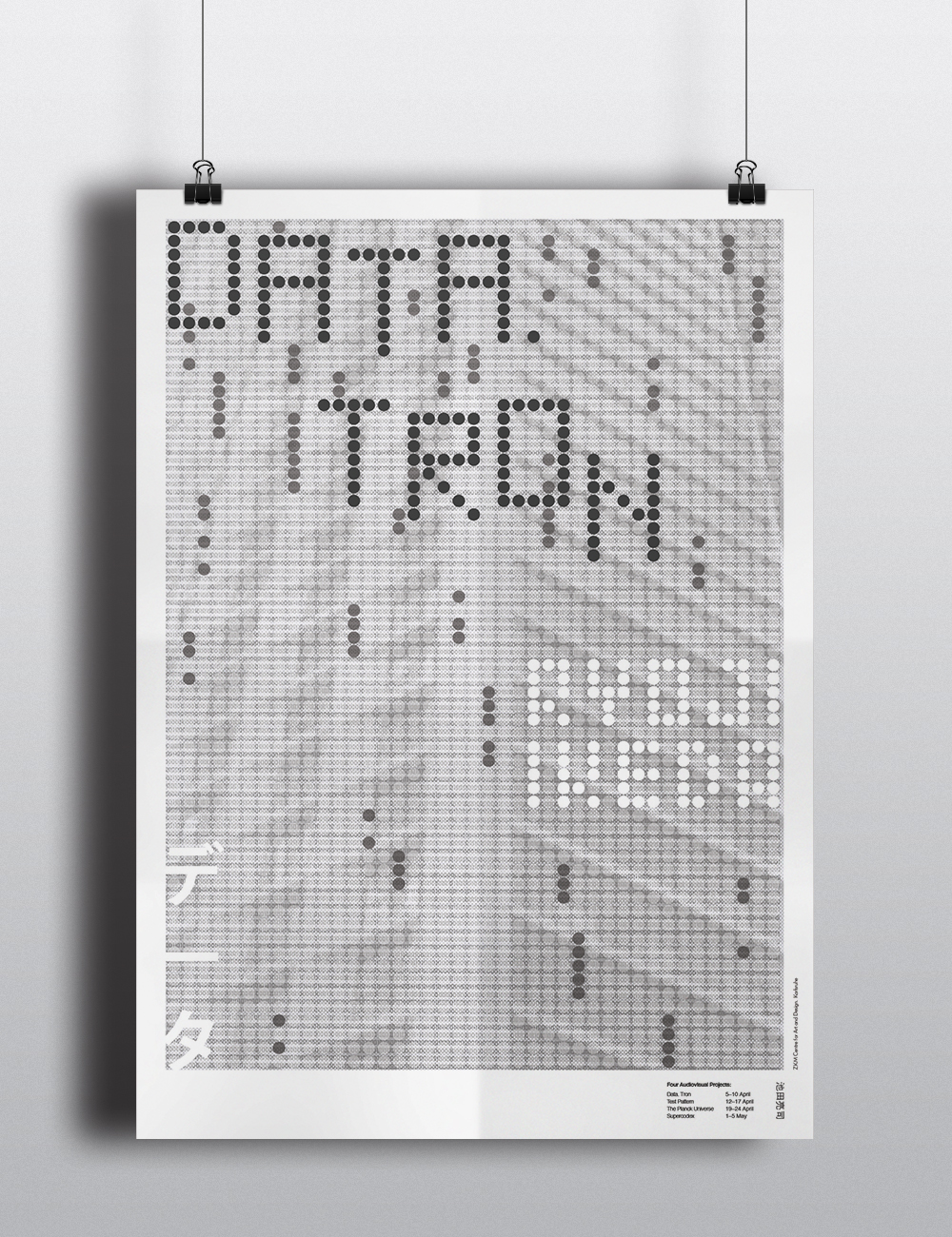
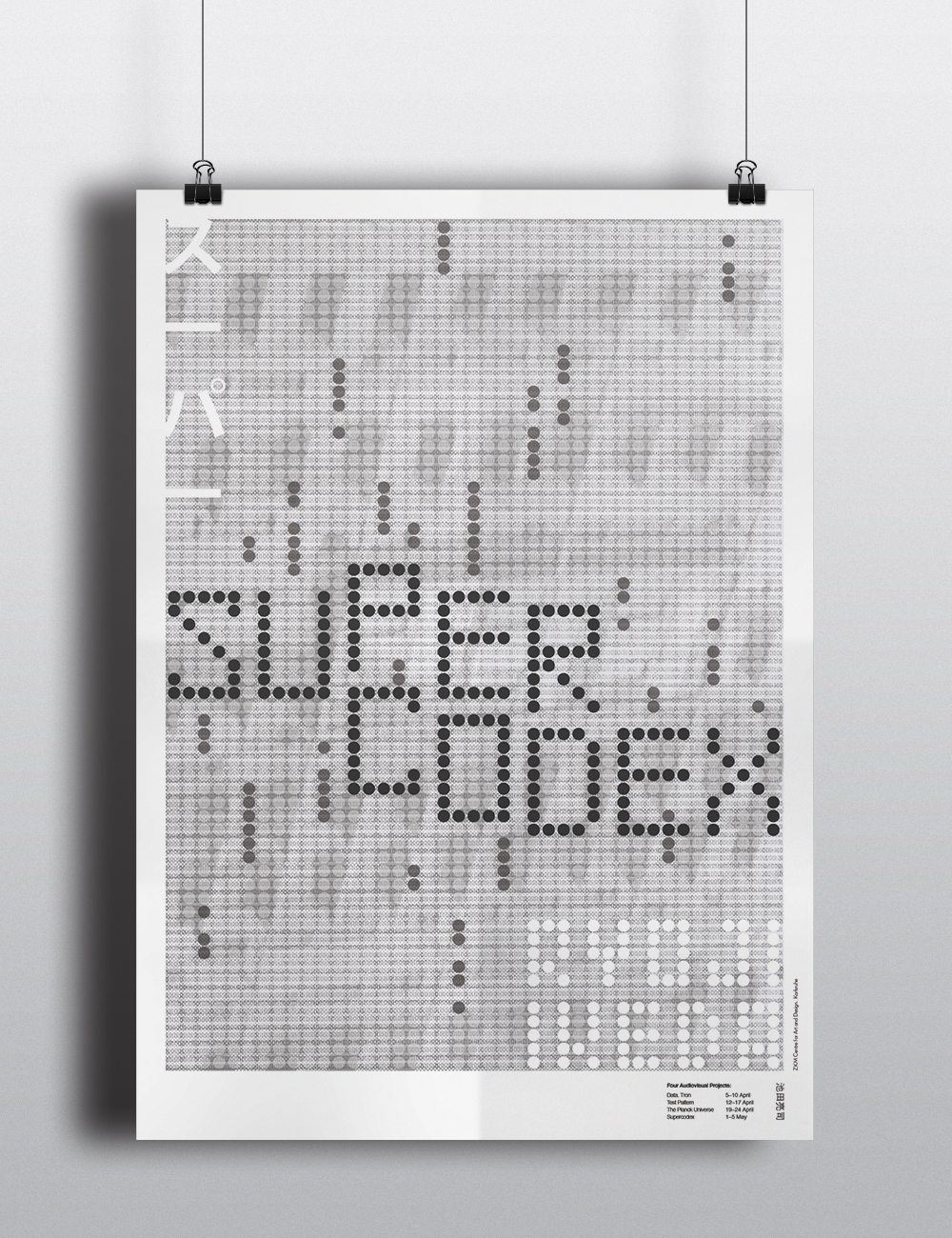
VISUAL SYSTEMS
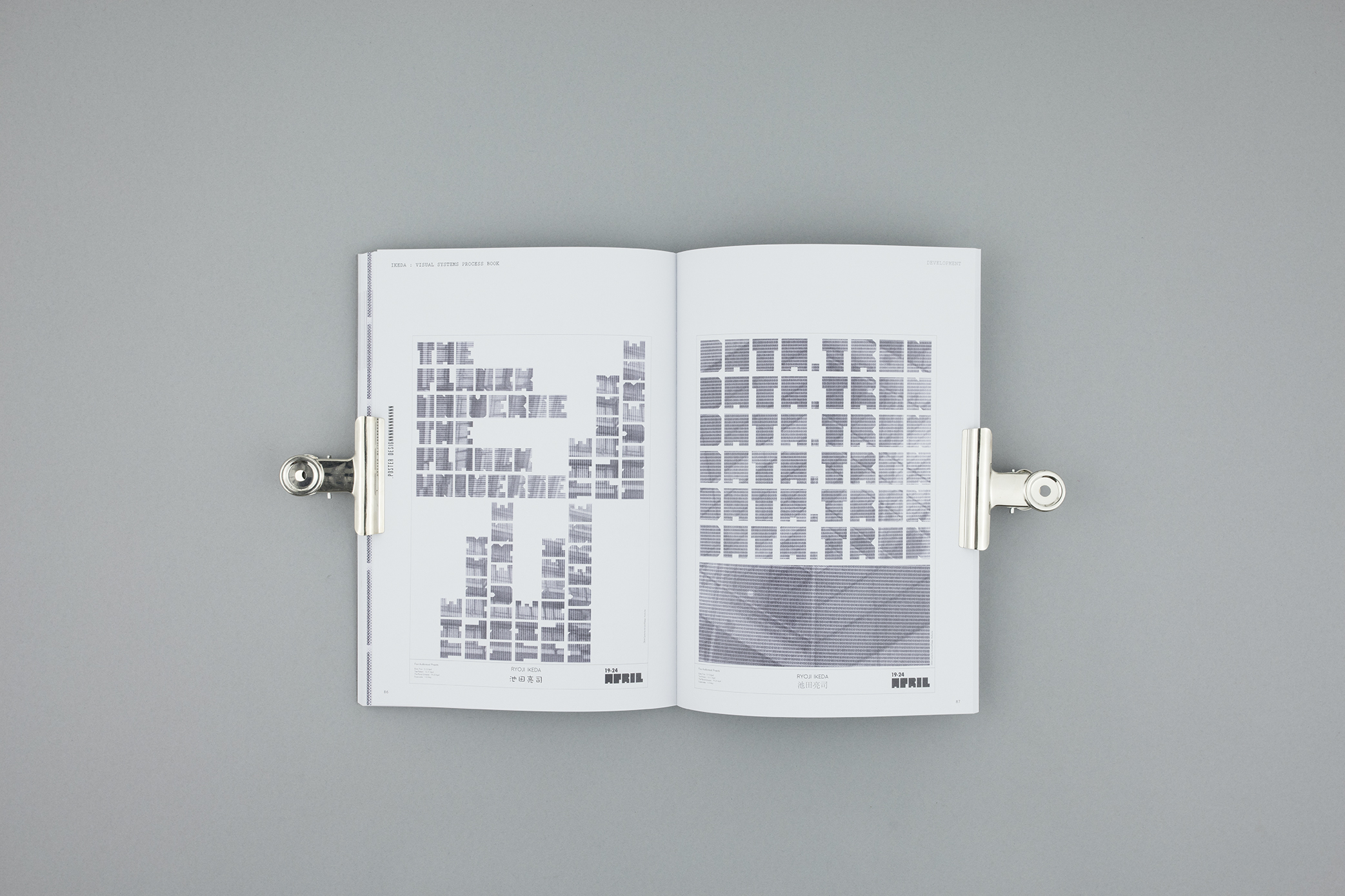
Ryoji Ikeda (Posters)
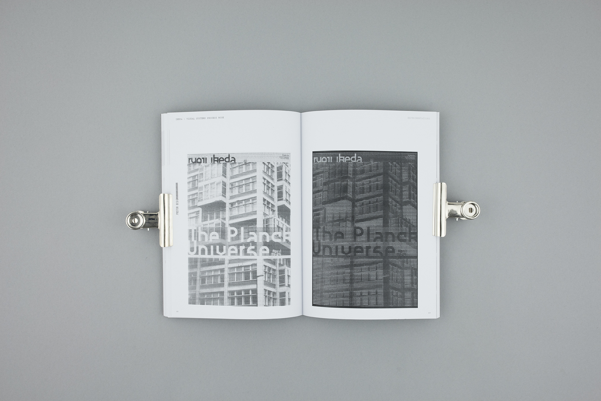
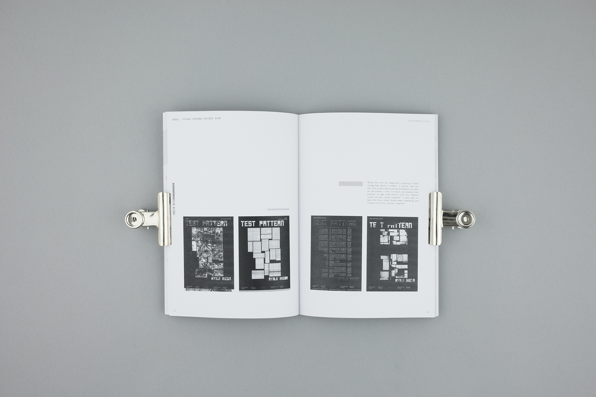
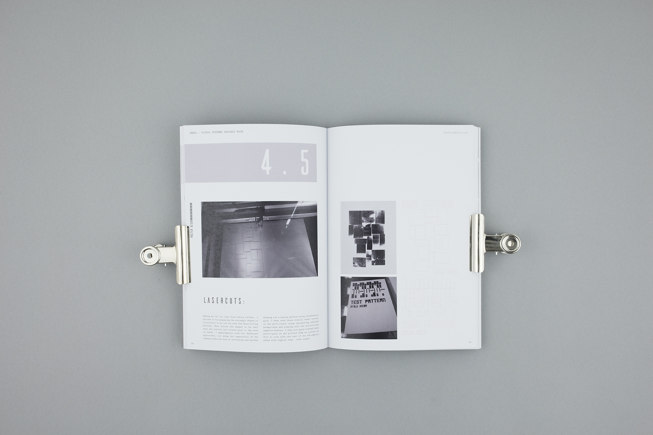
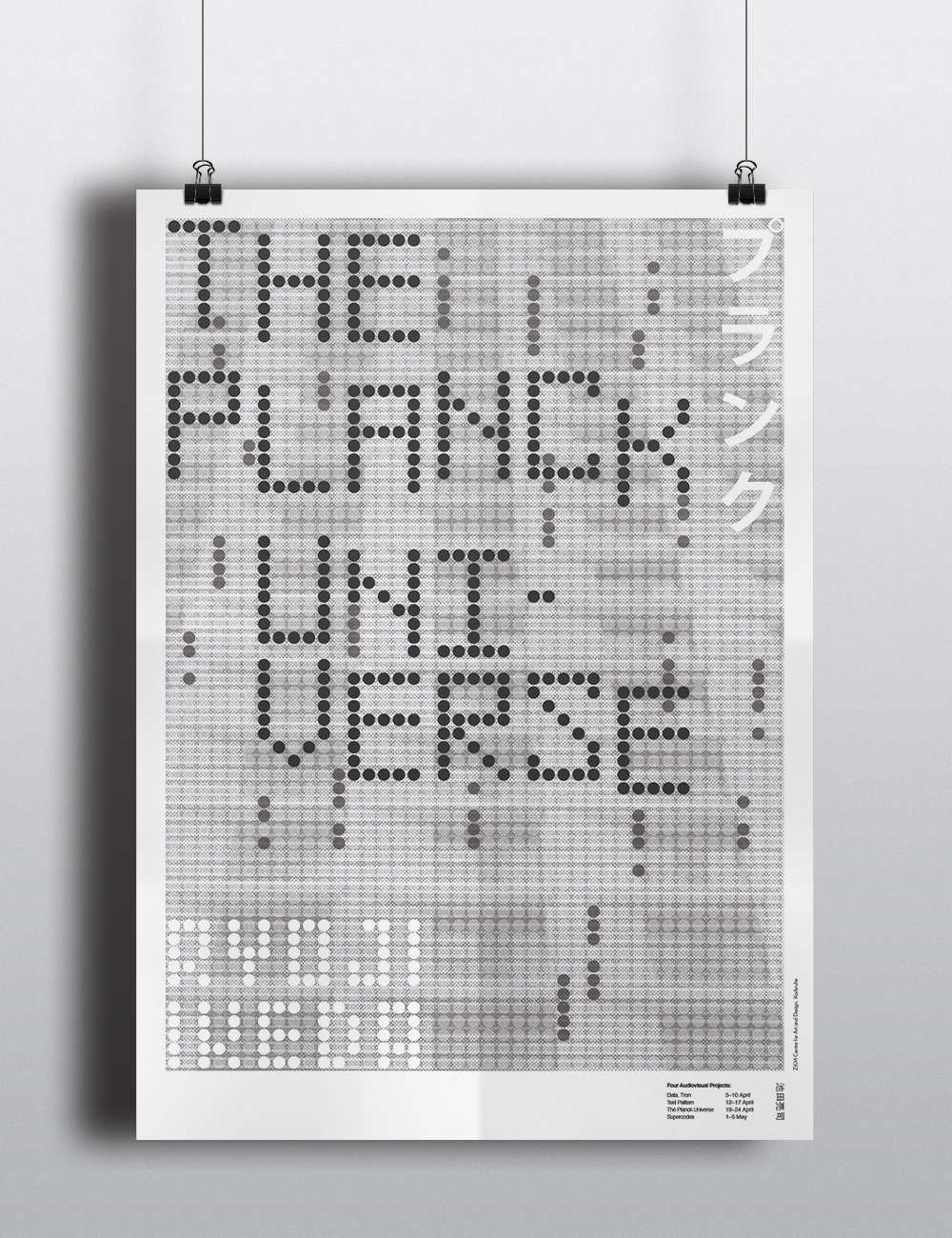
This brief explores poster design and creating a visual system for four audiovisual projects, which work together as a poster series. The final outcomes for this project were four A1 posters which were created with layers. I used the photocopier to get the background textures containing binary code representing each audiovisual project. This binary code printed on laser film was then laid over photographs I took showing repetition in architecture to enhance the themes of infinity and the universe Ikeda’s work portrays. The title type was created by using a circle grid to give the poster a feel of the matrix and LED movement.
Above : A few Images taken from my process Book
Below : The Final Outcomes
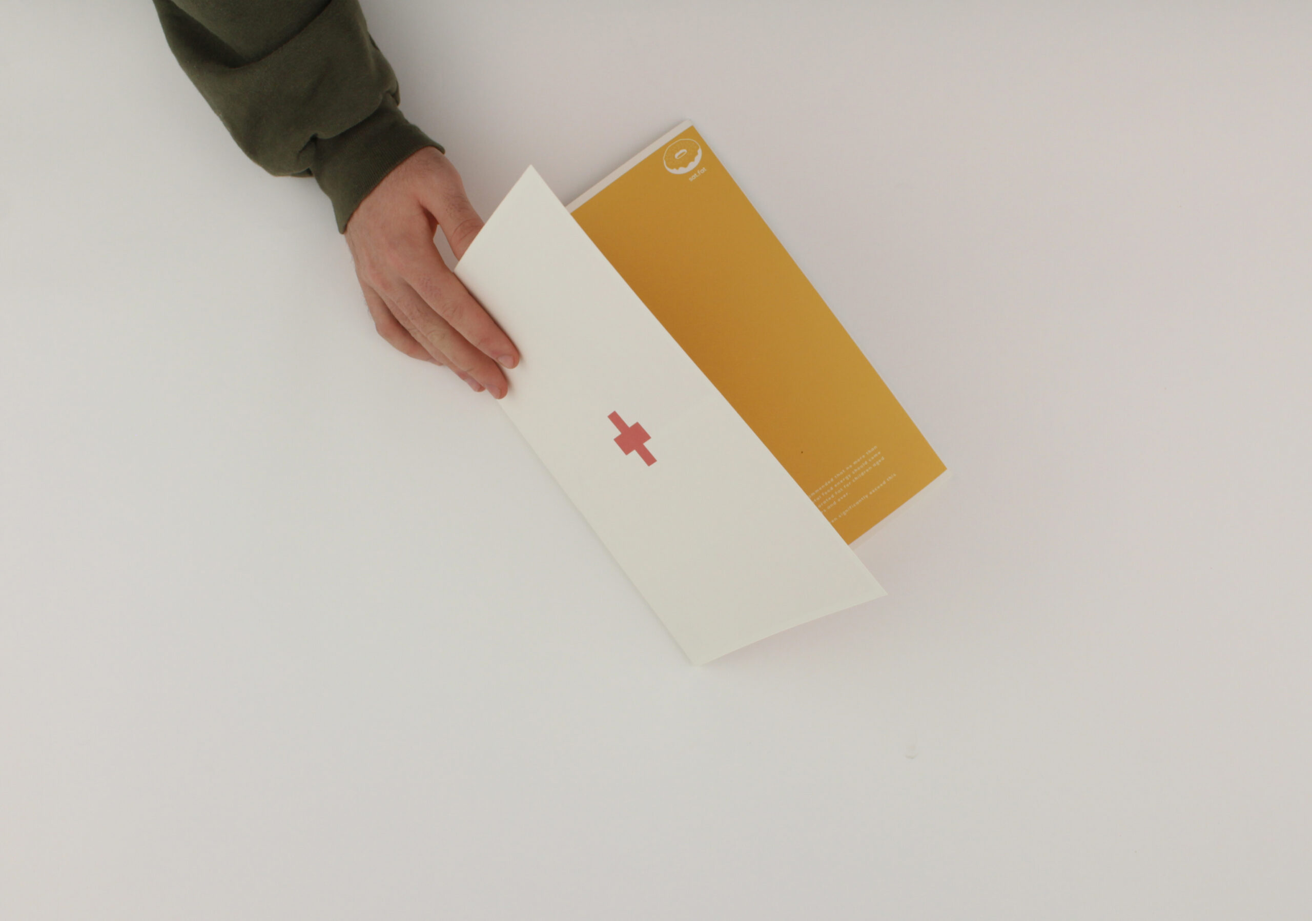
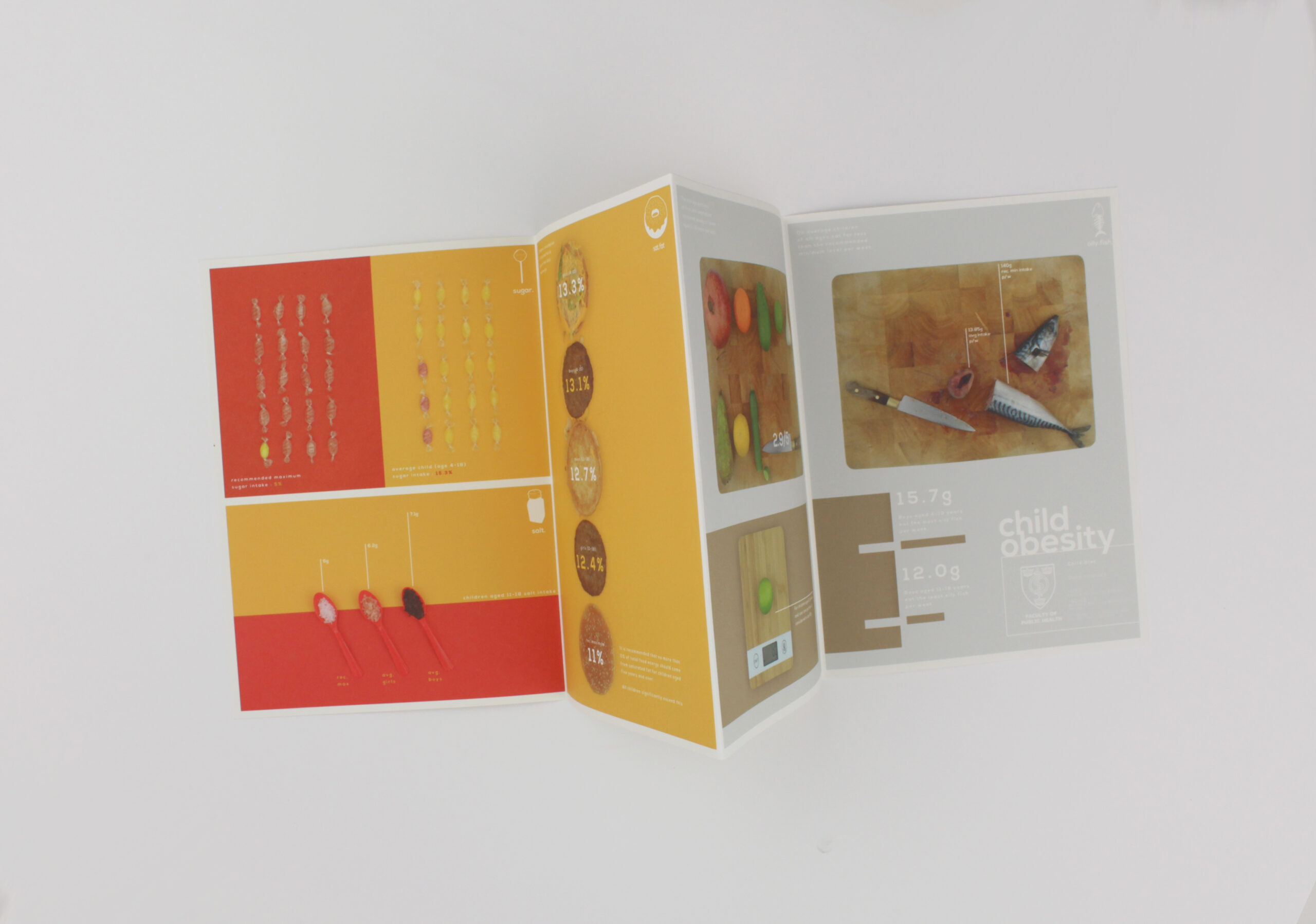
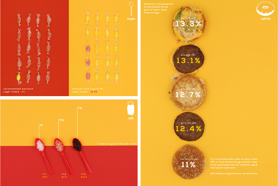
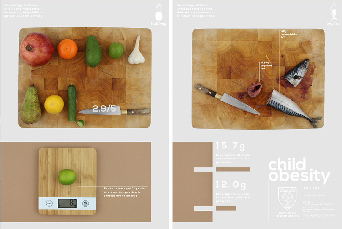
PUBLIC HEALTH TODAY
Magazine Insert
For this brief Public Health magazine supplied us with data sources for different topics which contained facts and information. They wanted me to design an infographic which makes the information clear and easy for people to understand quickly. I choose to go with child diet illustrating the foods which are overeaten with bright saturated colours and foods that are under eaten in lighter natural colours. My magazine insert is designed to be open in these two ways, contrasting the good and the bad in child diet.
CULTURAL IDENTITY CRISIS
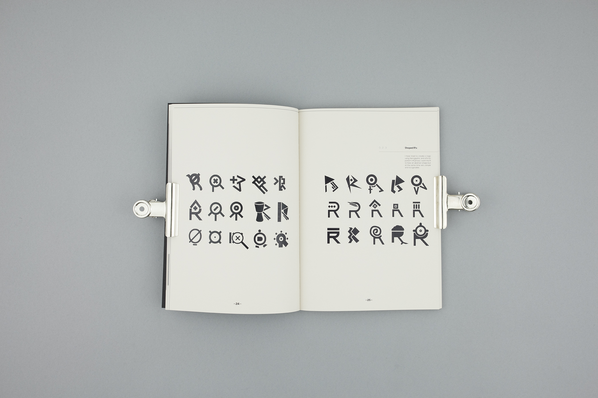
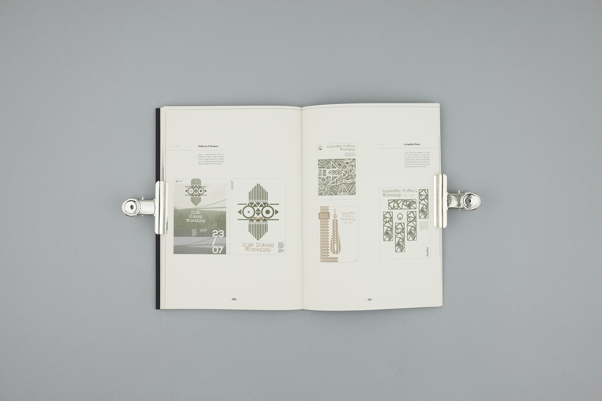
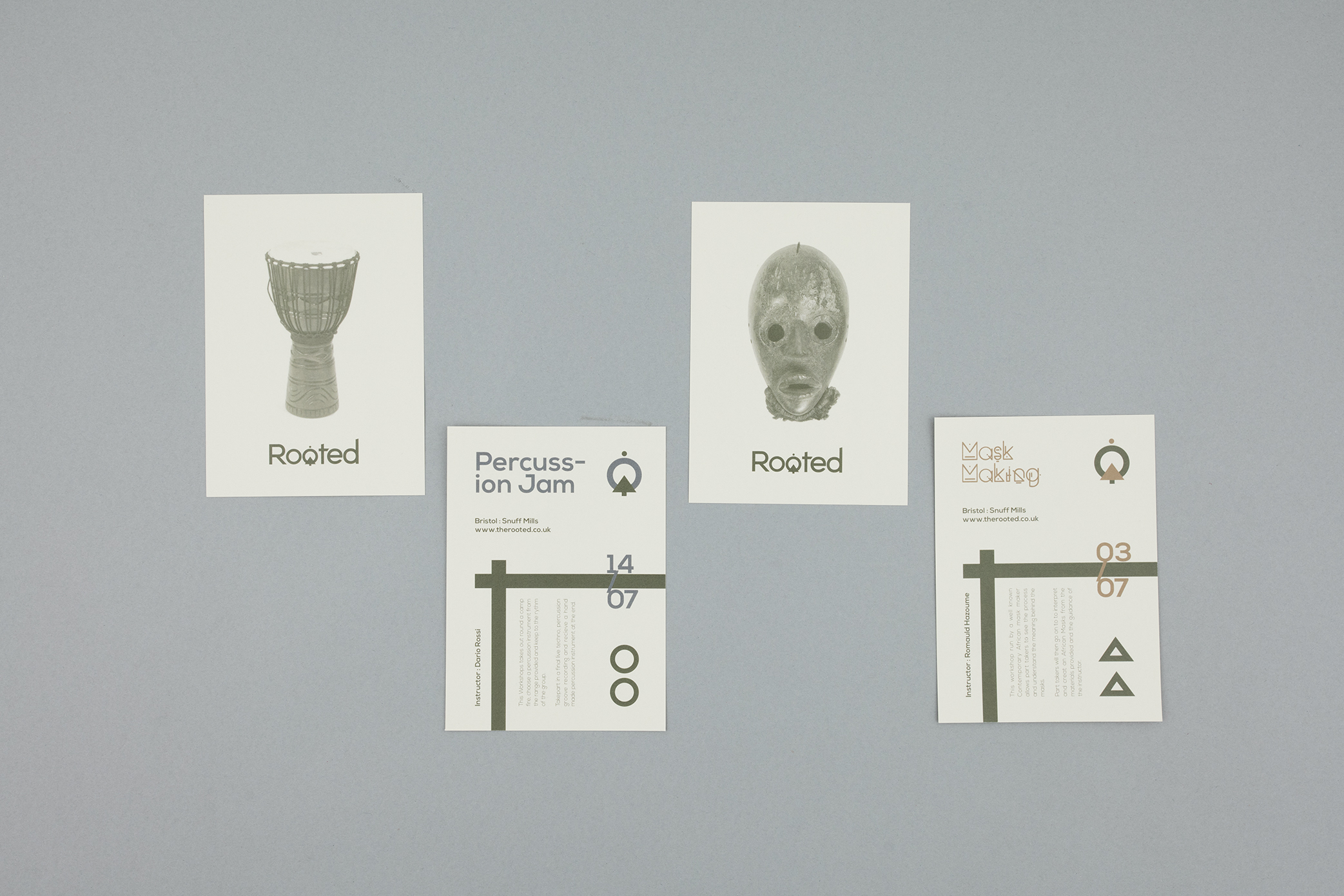
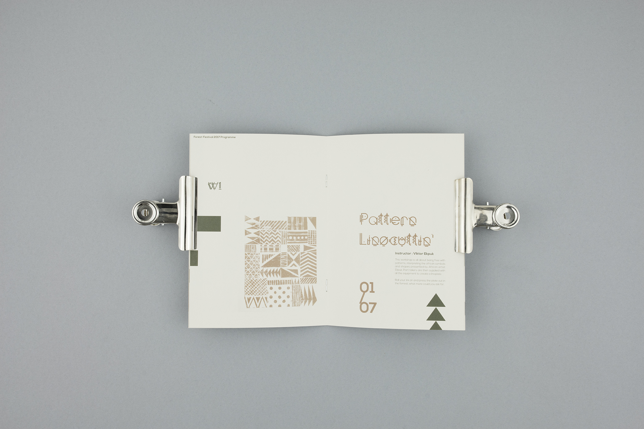
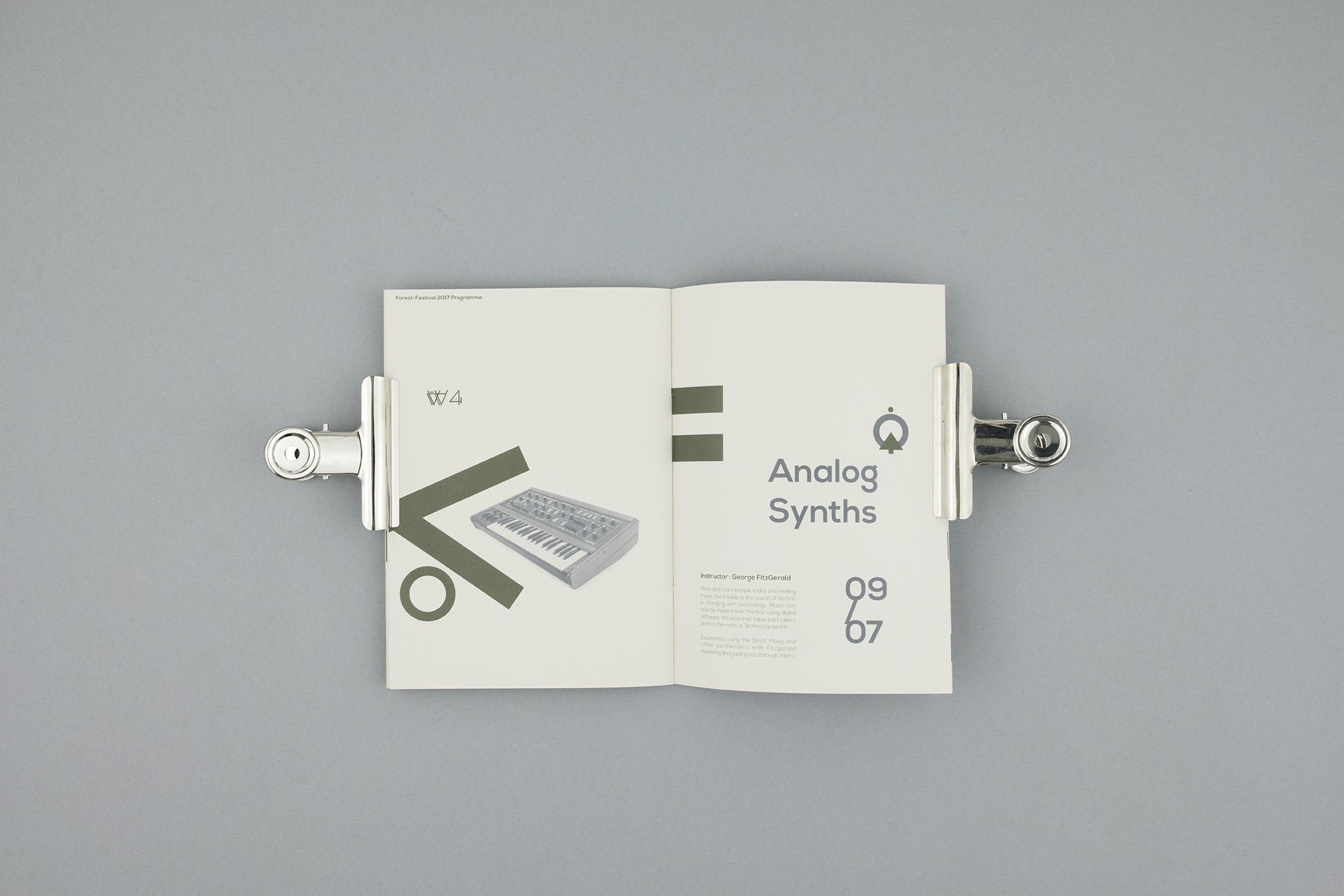
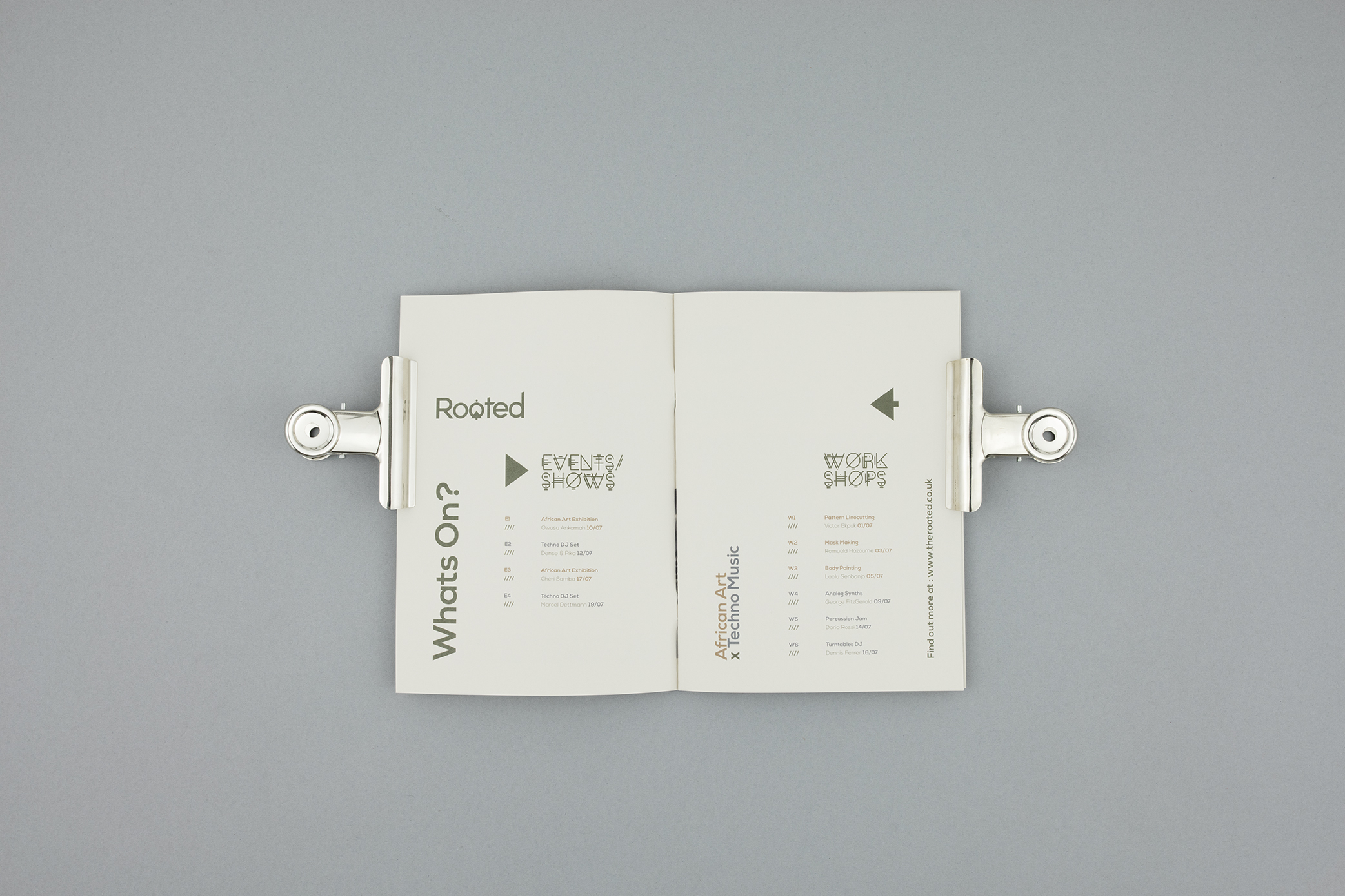
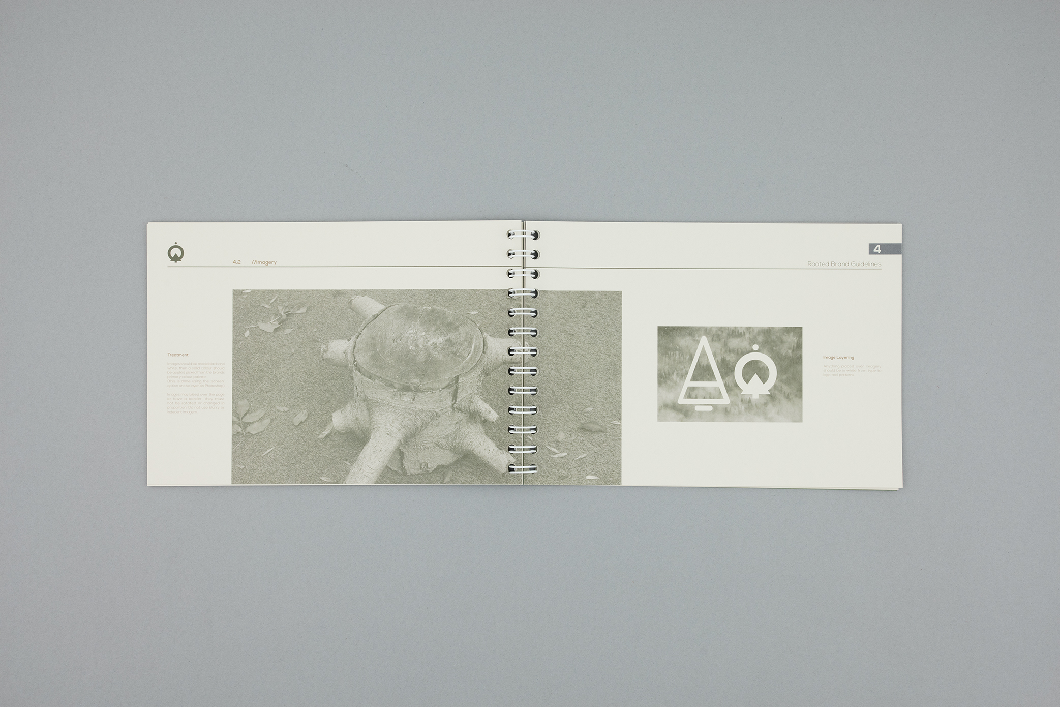
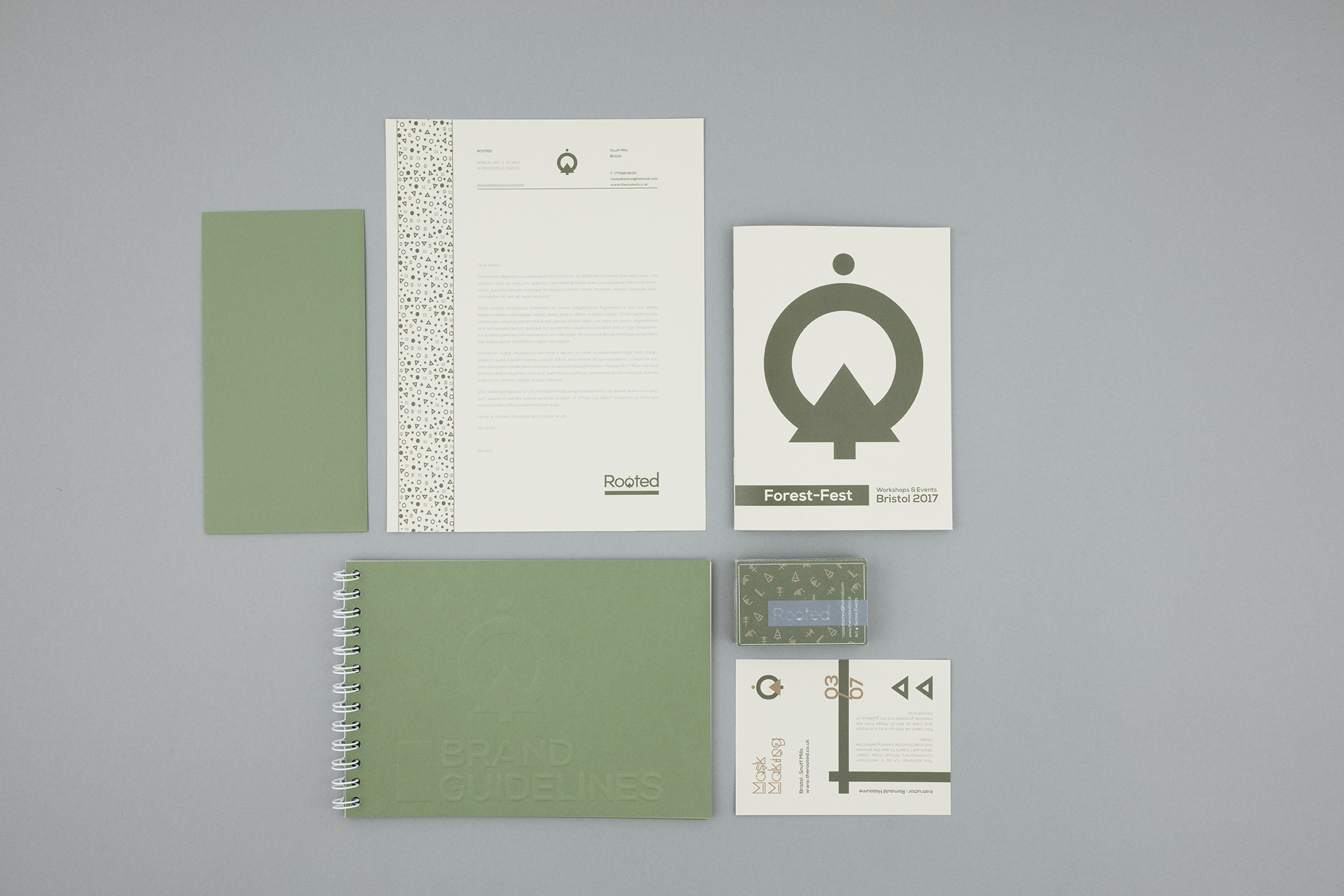
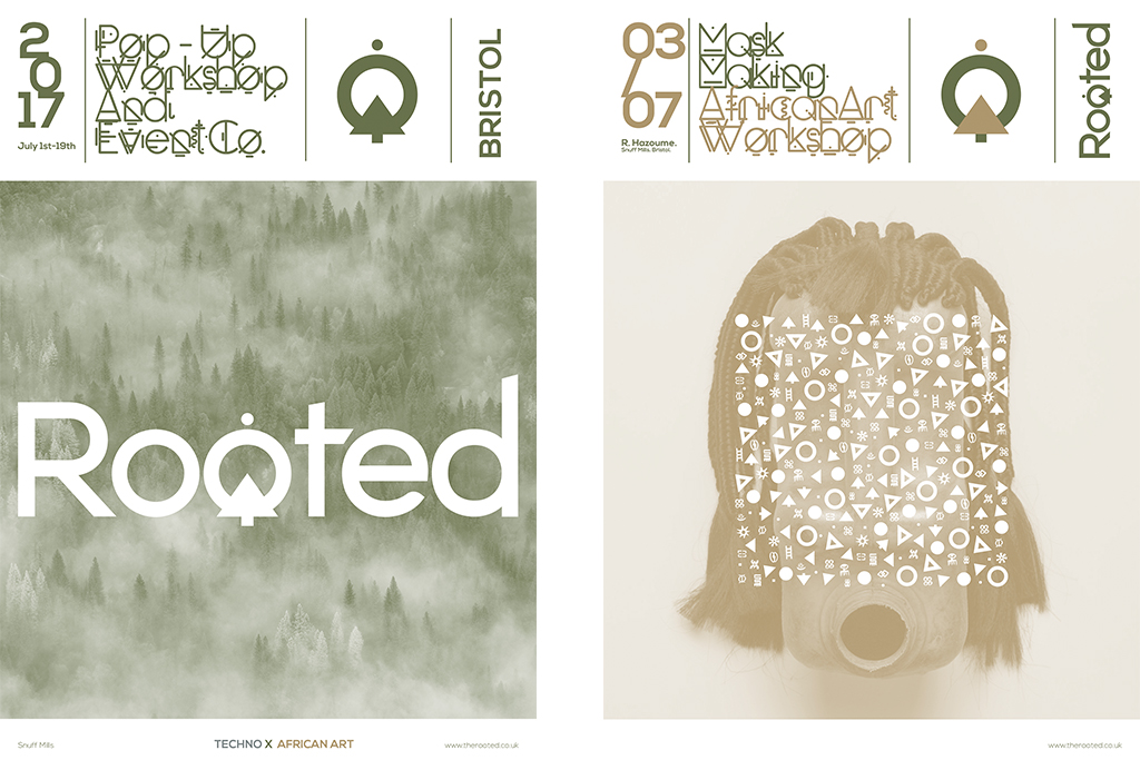
Rooted (Branding Project)
This brief was to find two cultures that could be married into one identity and language creating a brand. For this project I wanted to bring together techno music with African art and create a festival situated in the forests of Bristol. I was very inspired by the African Adinkra symbolism and the simple shapes that translate in my head when I am listening to techno music. Below are some pictures of my process book along with the brand identity look, along with some larger posters.

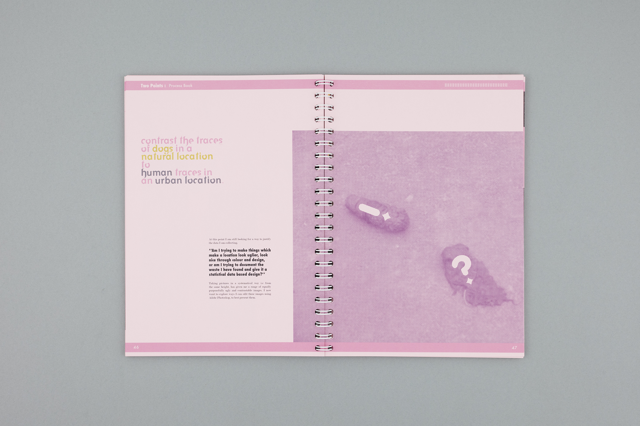
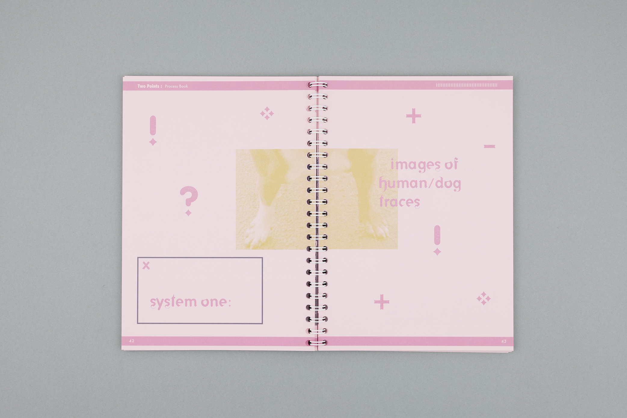
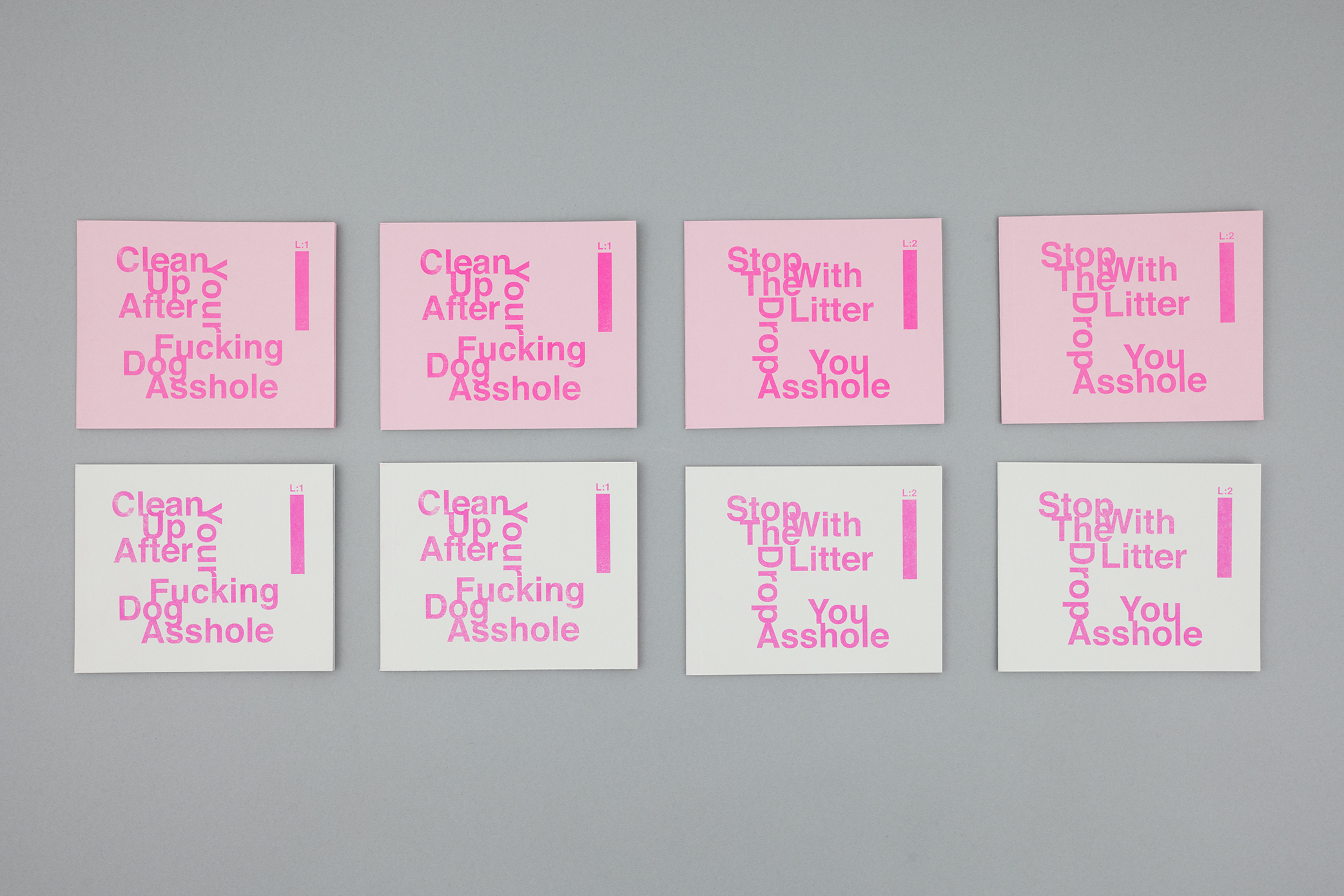
TWO POINTS
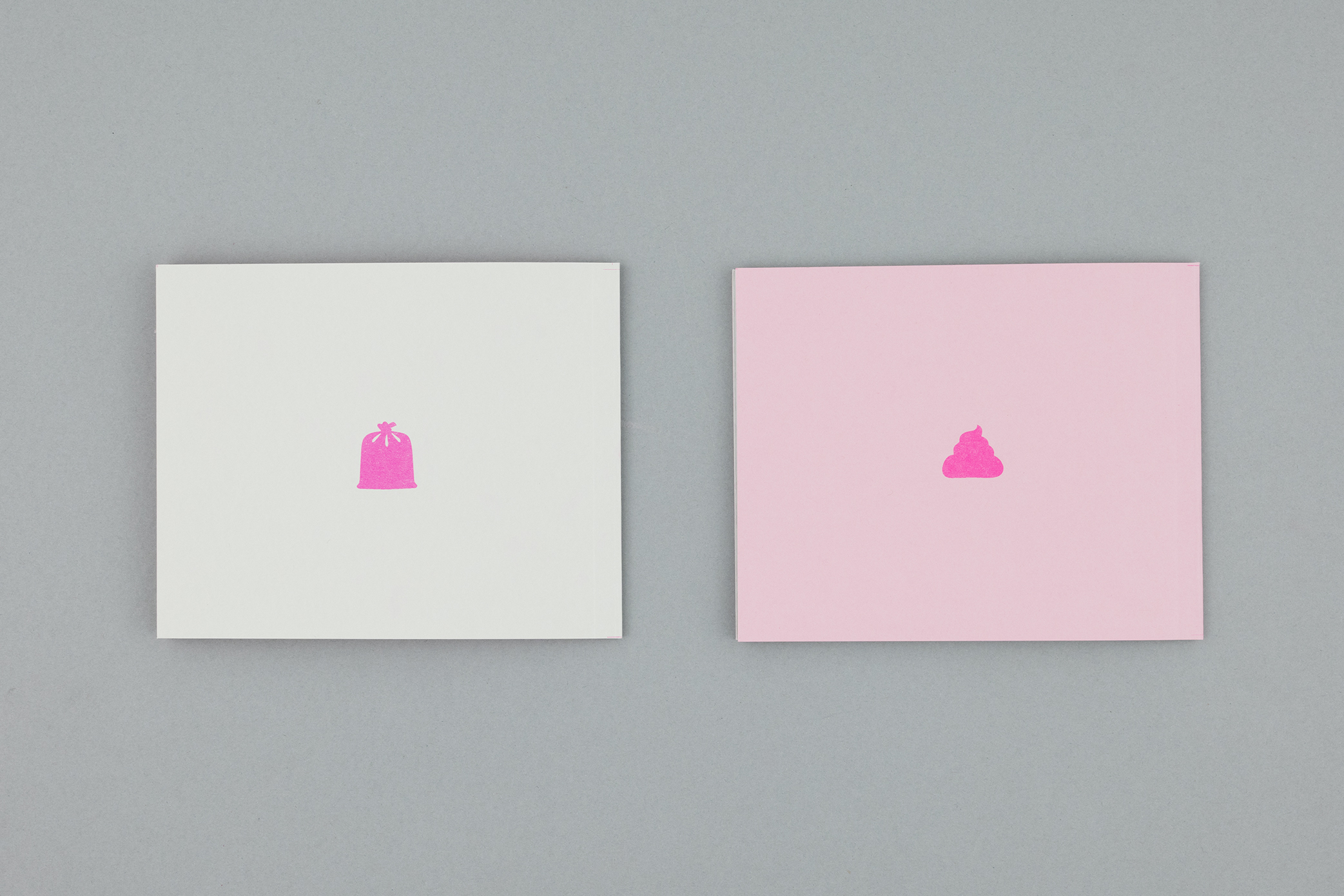
OUTCOME 1: Stop That Sh*t
I designed these French Folded, Risograph printed zines, they were intended to be given out to show that we still constantly litter the streets and dog sh*t is still left to crumble or be stepped on by someone. I chose to use the risograph as it is known to never really dry completely, hence when the viewer touches the images it would leave an unwanted fluorescent pink mark on their fingers, which can leave the same unwanted feeling of stepping in dog Sh*t. Below are some shots of my process book and the finished zine.


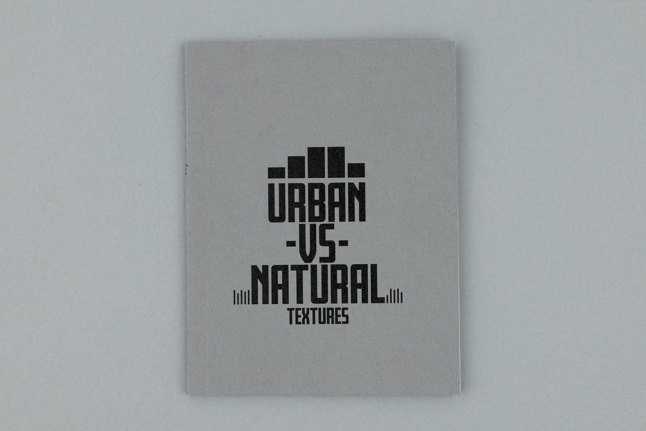
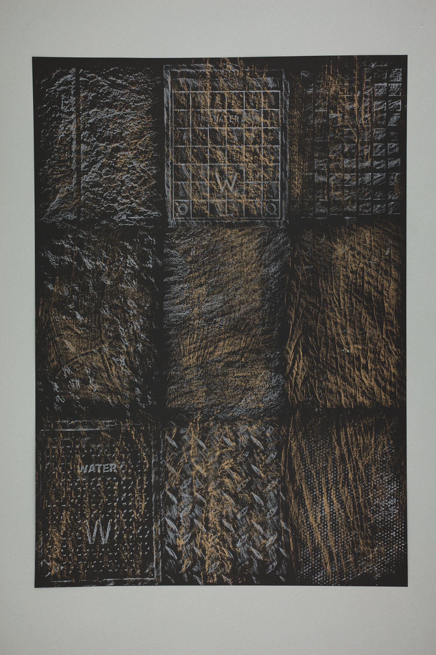
TWO POINTS
OUTCOME 2: Urban Vs Nature Textures Zine
A zine designed using my own rubbings taken from two different locations, creating a graphic contrast, between the beauty of textures in an urban and natural environment. I used a photocopier to print the textures from the actual rubbings taken. I also made a collection of duo colour A1 screen print which overlays 9 gold natural textures over silver urban textures.